Creating a block
Creating a Block (Method 1)
-
Login
- Log in to the site as a Web Admin user.
-
Access the Block Editor
- Click the blue Edit CTA in the top-right corner.
- If redirected to the CMS Dashboard, click the Edit icon in the left navigation menu.
-
Create a New Block
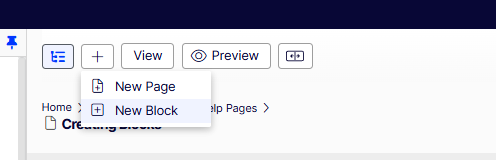
- Click the ➕ (plus) icon in the header and select New Block.
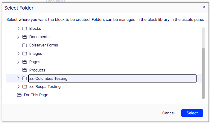
- In the Blocks Tree (expandable drawer on the right), choose a folder to create the block under.
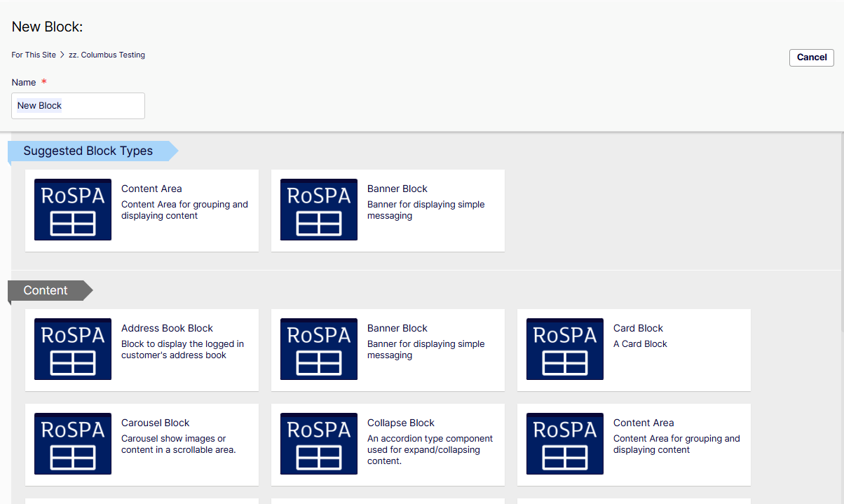
- Enter a Block Name and select the Block Type.
- Click the ➕ (plus) icon in the header and select New Block.
-
Configure Block Properties
- The block is created in an unpublished state.
- Review all tabs and ensure the required properties are set (as they vary by block type).
-
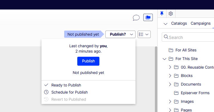
Publish the Block
- Once all content is added, click the Publish dropdown in the top-right.
- Select Publish to make the block live.
Creating a Block (Method 2)
-
Login (Same as Method 1)
- Log in to the site as a Web Admin user.
-
Access the Block Editor (Same as Method 1)
- Click the blue Edit CTA in the top-right corner.
- If redirected to the CMS Dashboard, click the Edit icon in the left navigation menu.
-
Create a New Block
- In the Blocks Tree (expandable drawer on the right), choose a folder to create the block under.
- Click + New Block at the bottom of the expandable drawer.
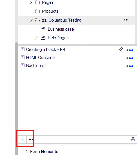
- Enter a Block Name and select the Block Type.
-
Configure Block Properties (Same as Method 1)
- The block is created in an unpublished state.
- Review all tabs and ensure the required properties are set (as they vary by block type).
-
Publish the Block (Same as Method 1)
- Once all content is added, click the Publish dropdown in the top-right.
- Select Publish to make the block live.
Uploading Media for use in pages / on blocks
-
Media Upload
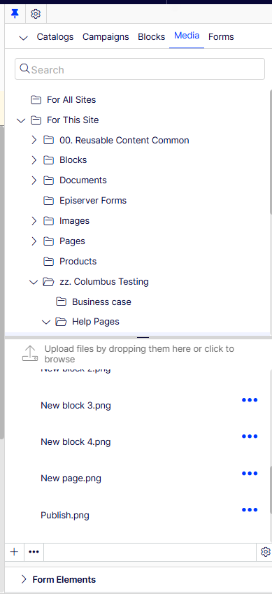
- In Admin, expand the Content Navigation Drawer on the right side of the screen.
- Click the Media tab.
-
Select a Folder
- Choose the folder where the media should be stored (for easy organization and retrieval).
-
Upload Media
- Drag the media files into the bottom content area below the "Upload Files" info text.
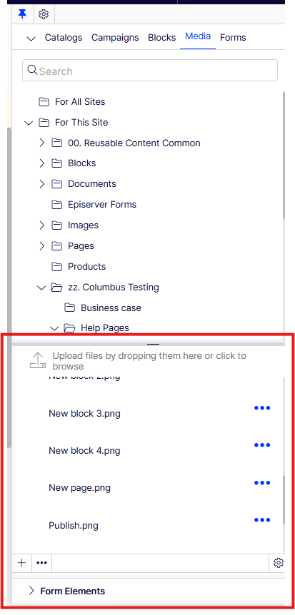
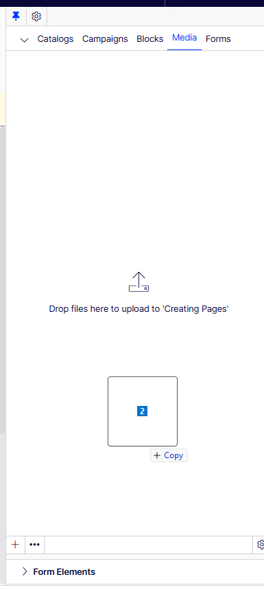
- Drag the media files into the bottom content area below the "Upload Files" info text.
-
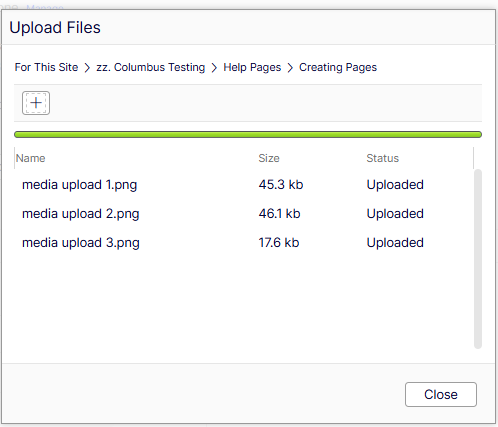
Monitor Upload Progress
- The Upload Modal will appear, showing the progress of each file.
- Wait for all uploads to complete.
-
Finalize Upload
- Click Close once all files have successfully uploaded.
Adding Media to Pages / Blocks
-
Drag Media into Editorial Content Areas
- Uploaded media assets can be dragged directly into content areas within editorial sections.
-
Use Images in Image Properties
- Images can be dragged into image properties such as:
- Page Partials
- Product Partials
- Hero Blocks
- Card Blocks
- Images can be dragged into image properties such as:
-
Use Videos in Content Areas & Video Properties
- Videos can be:
- Dragged directly into content areas.
- Placed into video properties for relevant blocks or components.
- Videos can be:
-
Verify Front-End Display
- The Image Samples Page and File Type Samples Page show how different media types will appear on the front end.
Adding blocks to pages
-
Locate the Block to add
- Ensure the block has been created.
- In the right-hand folder structure, find the block you want to add.
-
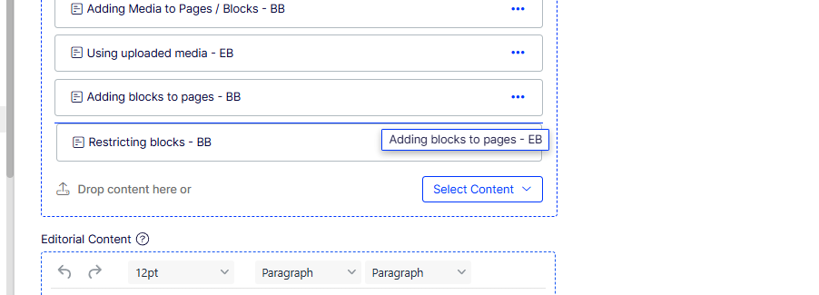
Drag the Block into the Content Area
- Drag the block directly into the main content area on a page.
- Blocks can also be added inside other blocks with content areas (e.g., Container Blocks).
-
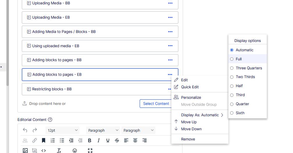
Adjust Block Display Size
- After adding the block, click the three dots on the block partial.
- Select "Display As" and choose a width option to control the block's size.
Adding blocks to Container blocks
Container Blocks can be used to group multiple blocks together, ensuring they stay aligned and responsive across different screen sizes.
-
Grouping Blocks with a Container Block
- Create a new Container Block .
- Drag multiple blocks into the container.
- Example: If a Container Block holds 4 blocks, each set to 1/4 width, they will display side by side.
- Add the Conter block to the page content area the same was as other blocks (detailed above)
-
Ensure Responsive Layout
- Blocks inside a Container Block will stay grouped together when the screen resolution changes, maintaining layout consistency.
How restrict blocks by audiences
-
Add the Block to the content area
- Add a block content area
-
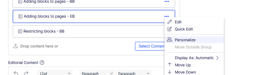
Personalize the Block's Visibility
- Click the three dots on the Block partial.
- Select Personalise.
-
 Select User Groups for Access
- In the Personalise menu, choose the user groups that should have access to view this block.
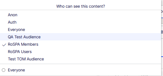
- In the Personalise menu, choose the user groups that should have access to view this block.
-
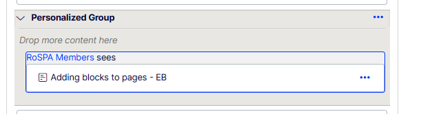
Save Changes
- The block will now only be visible to the selected groups (e.g., logged-in users).
- Any users not in the selected groups will be restricted from viewing the block.
Tips and Best practices
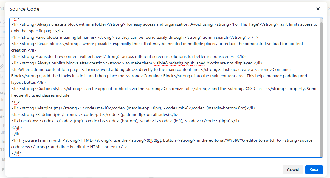
- Always create a block within a folder for easy access and organization. Avoid using 'For This Page' as it limits access to only that specific page.
- Give blocks meaningful names so they can be found easily through admin search.
- Reuse blocks where possible, especially those that may be needed in multiple places, to reduce the administrative load for content creation.
- Consider how content will behave across different screen resolutions for better responsiveness.
- Always publish blocks after creation to make them visible—unpublished blocks are not displayed.
- When adding content to a page, avoid adding blocks directly to the main content area. Instead, create a Container Block, add the blocks inside it, and then place the Container Block into the main content area. This helps manage padding and layout better.
- Custom styles can be applied to blocks via the Customize tab and the CSS Classes property. Some frequently used classes include:
- Margins (m):
mt-10(margin-top 10px),mb-8(margin-bottom 8px),m-8(margin 8px) - Padding (p):
p-8(padding 8px on all sides),pl-8(padding-left 8px) - Locations:
t(top),b(bottom),l(left),r(right)
- Margins (m):
-
Colour Hex Codes
- Lime Green:
bg-[#9ec73b] - Gradient Blue:
bg-gradient-to-r from-[#385FA8] to-[#2476AD] - Gradient Blue Vertical:
bg-gradient-to-b from-[#5E7ABB] to-[#375088] - Gradient Gold:
bg-gradient-to-r from-[#AE7D25] to-[#D1BE6F] - Gradient Orange:
bg-gradient-to-r from-[#D04A20] to-[#EC8B1A] - Gradient Pink:
bg-gradient-to-r from-[#96145c] to-[#cc0977] - Gradient Spill Blue:
bg-gradient-to-r from-[#018DAC] to-[#3A5DAE] - Opacity 5 White:
bg-white bg-opacity-5(Used on help pages with a blue banner and a lighter blue block within) - Solid Dark Blue:
bg-[#001E62] - Primary:
bg-primary - Solid Gray:
bg-[#F3F2F8] - Solid Green:
bg-[#009639] - Solid Light Blue:
bg-[#3a5dae] - Solid Off White:
bg-[#F7F7F7] - Solid Purple:
bg-[#D0006F] - Solid Turquoise:
bg-[#018EAA]
These styles can be applied to blocks using the CSS Classes property to control background colors and gradients.
-
These are just a selection of frequently used TailwindCSS classes for styling. For more detailed information on available classes, you can refer to the TailwindCSS Documentation: TailwindCSS Docs.
Please note that not all TailwindCSS classes have been implemented on the site. If you’re trying to achieve something specific and it's not working as expected, feel free to contact for assistance.
- Lime Green:
- If you are familiar with HTML, use the <> button in the editorial/WYSIWYG editor to switch to source code view and directly edit the HTML content and specify additional classes